Product Design/ User Growth
Product Design/ User Growth
Product Design/ User Growth
App Homepage Redesign
App Homepage Redesign
App Homepage Redesign
Improving Decision Efficiency for Active Users
Improving Decision Efficiency for Active Users
Improving Decision Efficiency for Active Users
— MEXC
Background
This project examined how active users make decisions on the app during routine use.
For these users, the homepage is not a starting point; it is a place they often revisit to evaluate markets, positions, and determine their next steps.
As features and content increased over time, important signals became more difficult to spot. This raised the cognitive load and slowed down everyday decision-making. The redesign aimed to improve clarity by helping users quickly understand their current context and identify the best next action, without needing extra learning or explanation.
Industry
Fintech
Year
2024
Client
MEXC
Role
Product Designer, UX Researcher
Delivery
App Design
Design Specification
This document shows how design decisions were translated into implementation specifications for cross-functional teams.
App Platform | Homepage Redesign | Personal Contribution
My role centered on redesigning the homepage to better support quick decision-making for active users. I worked closely with the Product, Operations, and Data teams. I reorganized the homepage to help users easily understand their current situation and take action, instead of sifting through dense or conflicting information.
1
Defined the homepage as a high-frequency decision surface
2
Drove cross-functional trade-offs to protect decision clarity instead of adding more features
3
Turned efficiency goals into clear, repeatable decision points on the homepage
4
Optimized high-frequency paths to minimize repeated actions and judgment cost
Introduction
At a Glance
Problem Definition
While active users used the app often, the homepage had gradually become more difficult to scan. Content grew denser, the visual hierarchy weakened, and too many actions competed for attention. As a result, users had to spend more time and mental effort figuring out what mattered and what to do next.
The problem wasn’t a lack of features. It was a loss of clarity in moments of repeated decision-making.
The Goal
Primary Goal
Enable active users to make faster, clearer decisions during everyday usage
Supporting Goal
Clarify the current state at a glance
Reduce unnecessary cognitive load on the homepage
Help users identify what matters now, not everything that exists
Research
From Observation to Design Direction
Competitive Insights
Most trading platforms place total assets and real-time P&L at the top of the homepage, so users can quickly understand their current position and move naturally into the next action.
In high-frequency usage scenarios, the homepage often serves as a place to assess the current state before acting, rather than as a hub for feature navigation.
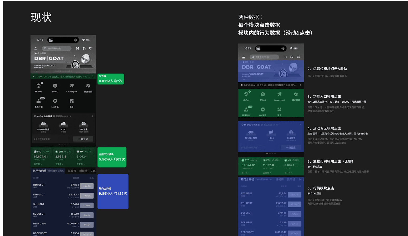
User Behavior Analysis
Product data analysis revealed that users most frequently enter the homepage to check asset status and market movements, rather than to explore new features or content.
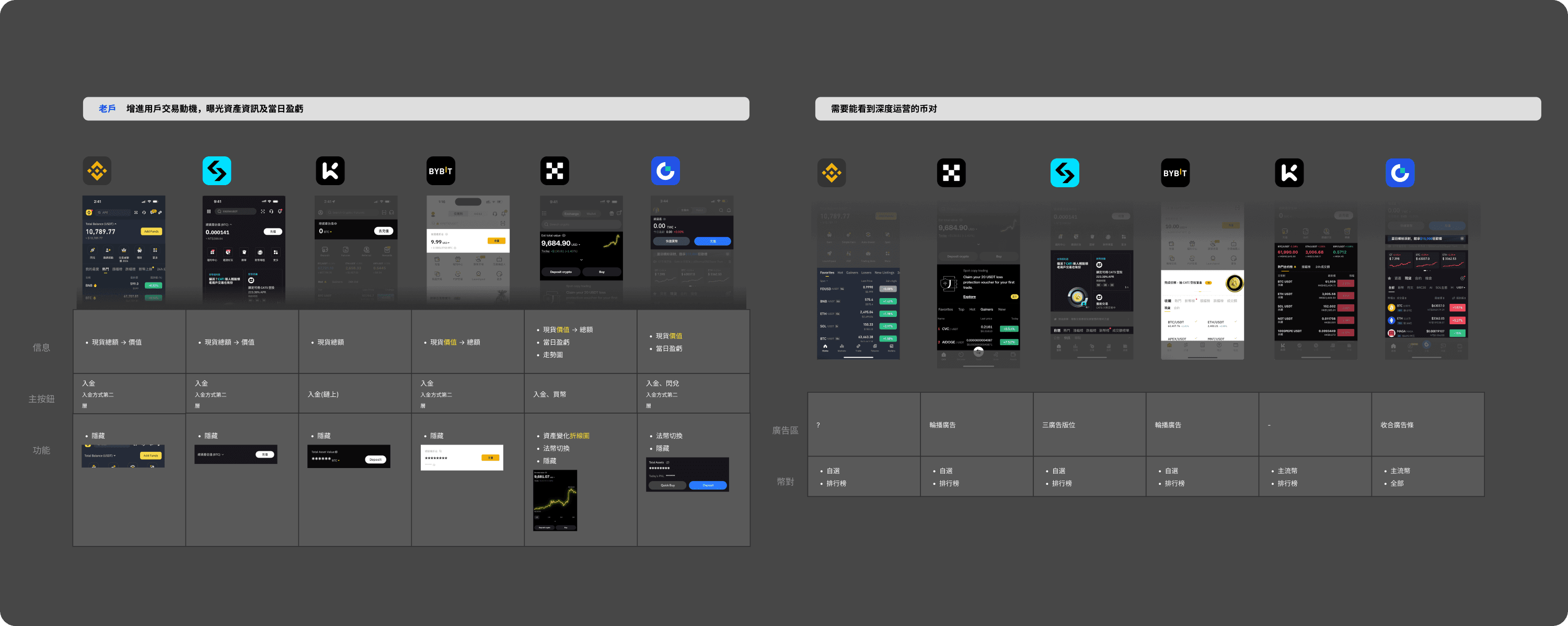
Competitive Insights
Usage Data
Analysis of homepage interaction data over the past three months shows:
Multiple modules overlap in both purpose and visual prominence.
Competition for attention between modules is high.
As a result, key decision signals are diluted.
This fragmentation reduces the homepage’s ability to support fast, repeated decision-making.
Usage Data
Key Insights
1
Frequent users mainly use the homepage to check their current state, rather than explore features.
They are not browsing for functionality. They want to quickly understand asset changes and market conditions, then decide whether to act.
2
When multiple homepage modules compete for attention, decision-critical signals become diluted, increasing the effort required to make judgments.
This raises cognitive load, slows decision-making, and reduces the homepage’s effectiveness for repeated use.
Key Design Decisions
Decision
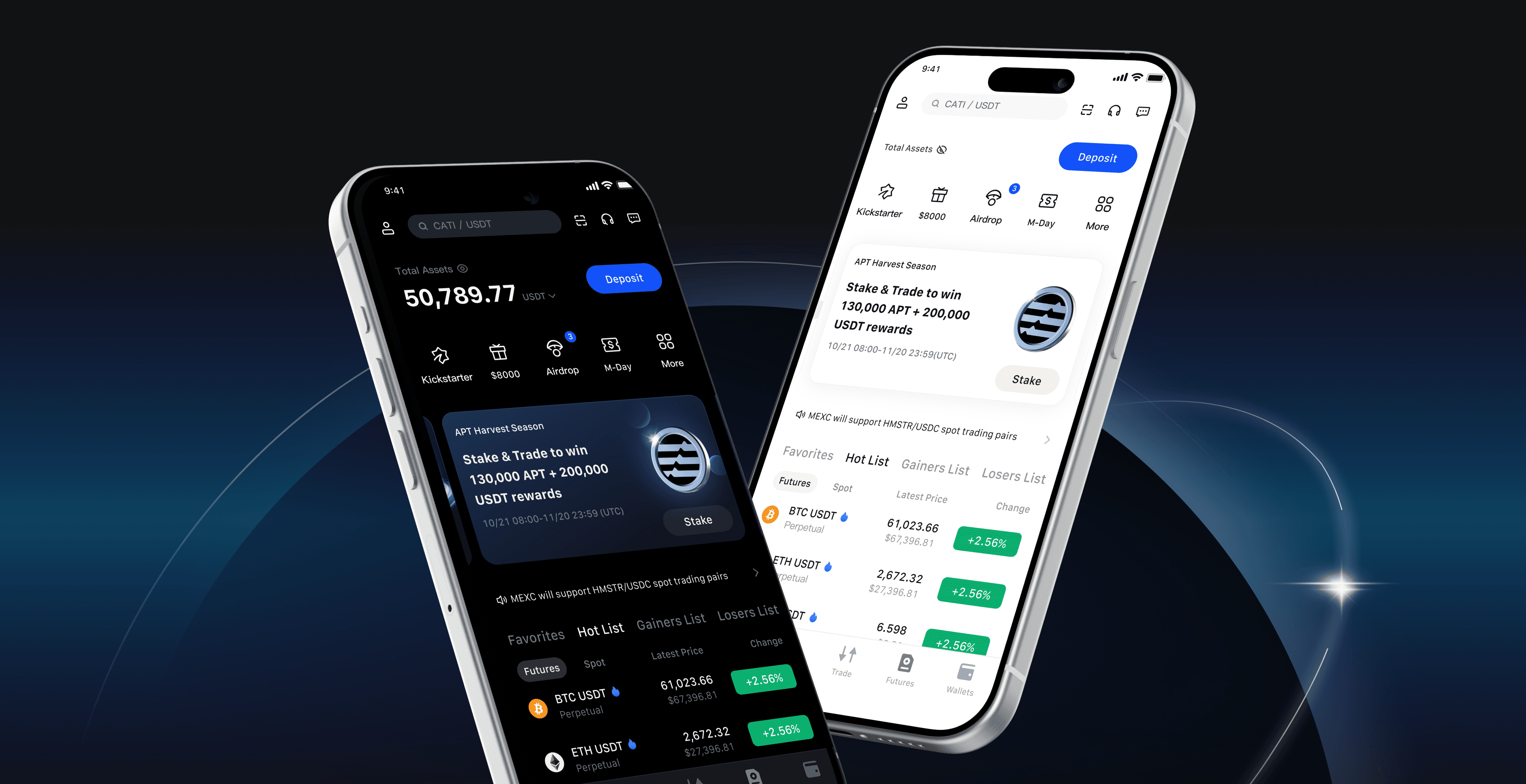
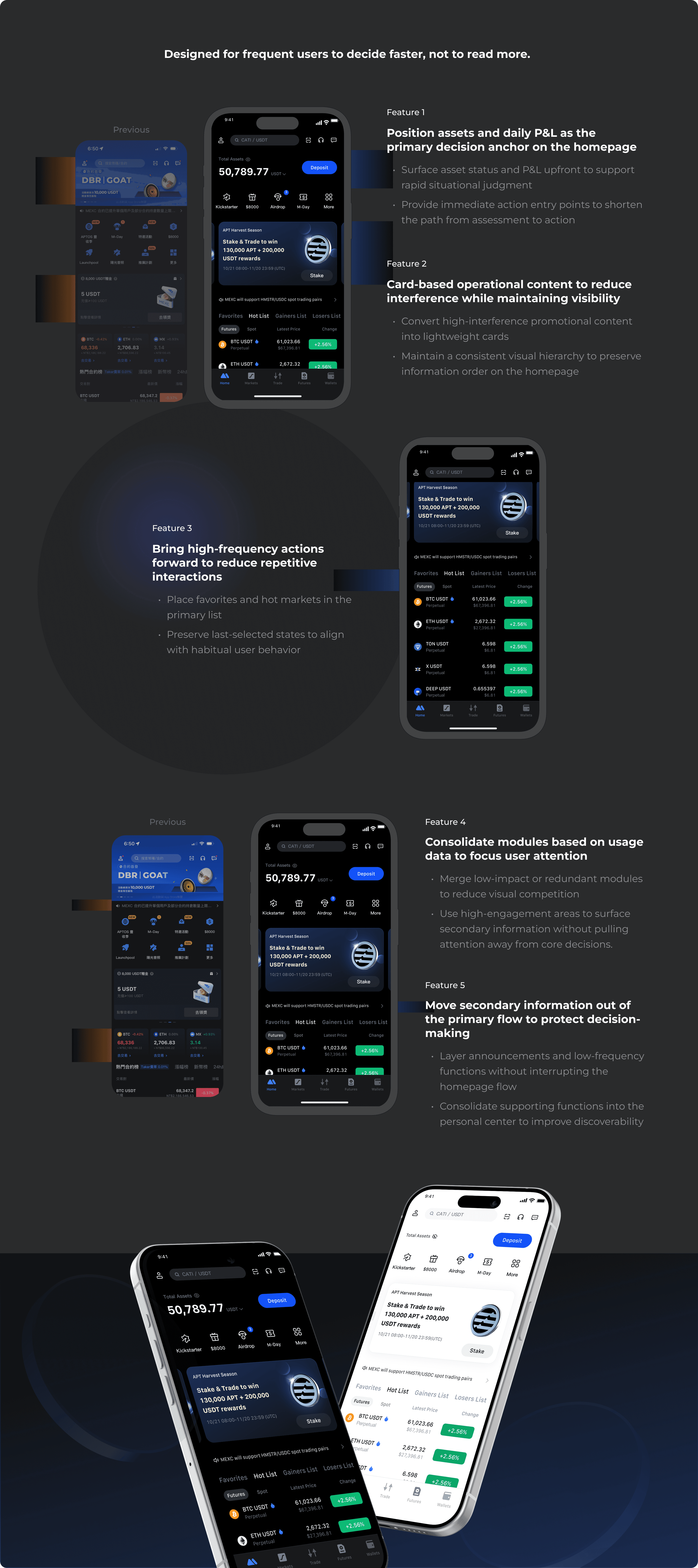
Make asset status and market signals the top visual priority
The homepage brings asset overview and real-time market signals to the forefront, aligning with how frequent users assess their current state before taking action.
Decision
Reduce the visual dominance of operational modules without removing them
Operational and promotional modules are de-emphasized through clearer card hierarchy, preserving access while preventing decision-critical information from being diluted.
Decision
Prioritize high-frequency decision paths
The layout prioritizes the actions users perform most often, such as monitoring assets, tracking price movement, and executing trades, over exploratory or low-frequency functions.
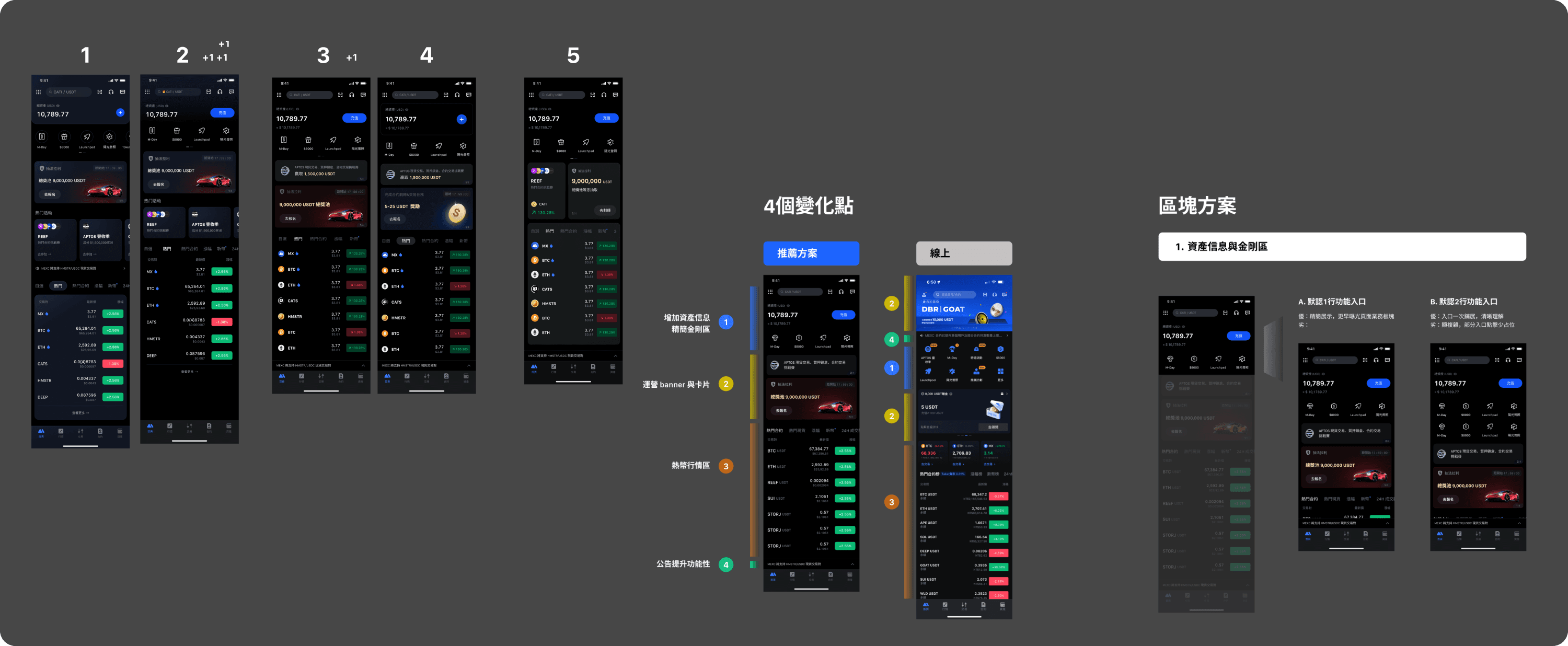
Design Solution
Design Solutions
Outcome
This iteration redefined the role of the homepage as a decision starting point for frequent users, supporting faster judgment rather than broad feature exploration.
By reorganizing information hierarchy and consolidating modules, the redesign reduced visual interference and helped users grasp their current state and take action within a shorter time.
As the homepage serves multiple business needs and exposure requirements, this update required careful trade-offs within limited space. I worked closely with Product, Operations, and Data teams to analyze user behavior, review competitor patterns, and clarify the logic, strengths, and constraints of each option. This process helped the team align on the underlying design rationale and decision principles.
As a result, the app homepage achieved a more coherent functional structure and visual hierarchy. The same design approach was later extended to other homepage variants—visitor, early-stage user, and regular usage states—allowing the product to support different user contexts with consistent design logic.
Design Critique Process
Reflection
This project reminded me that in high-frequency usage scenarios, clarity and prioritization matter more than adding new information. Reducing what users need to process often improves decision speed more than expanding functionality.
Thoughtful reduction and prioritization often improve efficiency more effectively than adding new features. By aligning user state, decision context, and business goals, design can drive meaningful behavior change without increasing interaction cost.
Introduction
At a Glance
Problem Definition
While active users used the app often, the homepage had gradually become more difficult to scan. Content grew denser, the visual hierarchy weakened, and too many actions competed for attention. As a result, users had to spend more time and mental effort figuring out what mattered and what to do next.
The problem wasn’t a lack of features. It was a loss of clarity in moments of repeated decision-making.
The Goal
Primary Goal
Enable active users to make faster, clearer decisions during everyday usage
Supporting Goal
Clarify the current state at a glance
Reduce unnecessary cognitive load on the homepage
Help users identify what matters now, not everything that exists
Research
From Observation to Design Direction
Competitive Insights
Most trading platforms place total assets and real-time P&L at the top of the homepage, so users can quickly understand their current position and move naturally into the next action.
In high-frequency usage scenarios, the homepage often serves as a place to assess the current state before acting, rather than as a hub for feature navigation.
User Behavior Analysis
Product data analysis revealed that users most frequently enter the homepage to check asset status and market movements, rather than to explore new features or content.
Competitive Insights
Usage Data
Analysis of homepage interaction data over the past three months shows:
Multiple modules overlap in both purpose and visual prominence.
Competition for attention between modules is high.
As a result, key decision signals are diluted.
This fragmentation reduces the homepage’s ability to support fast, repeated decision-making.
Usage Data
Key Insights
1
Frequent users mainly use the homepage to check their current state, rather than explore features.
They are not browsing for functionality. They want to quickly understand asset changes and market conditions, then decide whether to act.
2
When multiple homepage modules compete for attention, decision-critical signals become diluted, increasing the effort required to make judgments.
This raises cognitive load, slows decision-making, and reduces the homepage’s effectiveness for repeated use.
Key Design Decisions
Decision
Make asset status and market signals the top visual priority
The homepage brings asset overview and real-time market signals to the forefront, aligning with how frequent users assess their current state before taking action.
Decision
Reduce the visual dominance of operational modules without removing them
Operational and promotional modules are de-emphasized through clearer card hierarchy, preserving access while preventing decision-critical information from being diluted.
Decision
Prioritize high-frequency decision paths
The layout prioritizes the actions users perform most often, such as monitoring assets, tracking price movement, and executing trades, over exploratory or low-frequency functions.
Design Solution
Design Solutions
Outcome
This iteration redefined the role of the homepage as a decision starting point for frequent users, supporting faster judgment rather than broad feature exploration.
By reorganizing information hierarchy and consolidating modules, the redesign reduced visual interference and helped users grasp their current state and take action within a shorter time.
As the homepage serves multiple business needs and exposure requirements, this update required careful trade-offs within limited space. I worked closely with Product, Operations, and Data teams to analyze user behavior, review competitor patterns, and clarify the logic, strengths, and constraints of each option. This process helped the team align on the underlying design rationale and decision principles.
As a result, the app homepage achieved a more coherent functional structure and visual hierarchy. The same design approach was later extended to other homepage variants—visitor, early-stage user, and regular usage states—allowing the product to support different user contexts with consistent design logic.
Design Critique Process
Reflection
This project reminded me that in high-frequency usage scenarios, clarity and prioritization matter more than adding new information. Reducing what users need to process often improves decision speed more than expanding functionality.
Thoughtful reduction and prioritization often improve efficiency more effectively than adding new features. By aligning user state, decision context, and business goals, design can drive meaningful behavior change without increasing interaction cost.