Product Design/ User Growth
Product Design/ User Growth
Product Design/ User Growth
Designing Deposit Activation for Newly Registered Users
Designing Deposit Activation for Newly Registered Users
Designing Deposit Activation for Newly Registered Users
Sign-up → First Deposit and Early Engagement
Sign-up → First Deposit and Early Engagement
Sign-up → First Deposit and Early Engagement
— MEXC
Background
New users often understood why they should make a deposit, but hesitated when it came to how to start.
This project focused on what happens right after registration—where uncertainty around timing, amount, and reversibility caused many users to pause before their first deposit.
Industry
Fintech
Year
2024
Client
MEXC
Role
Product Designer, UX Researcher
Delivery
App Design
App Platform | New User Deposit Activation | Personal Contribution
1
Defined the new user phase as a key activation decision point
2
Embedded deposit actions into reward and task completion flows
3
Emphasized immediate, tangible value over full feature explanations
4
Reduced mental and interaction effort through clear, focused design
Introduction
At a Glance
Problem
After signing up, many users paused before making their first deposit.
They were unsure about the right timing, the minimum amount, or whether the action was reversible.
As a result, many users dropped off at a critical moment in onboarding.
The Goal
Primary Goal
Guide newly registered users to complete their first deposit
Supporting Goal
Make the first deposit feel clear, reversible, and guided—rather than overwhelming or risky.
Key Design Decisions
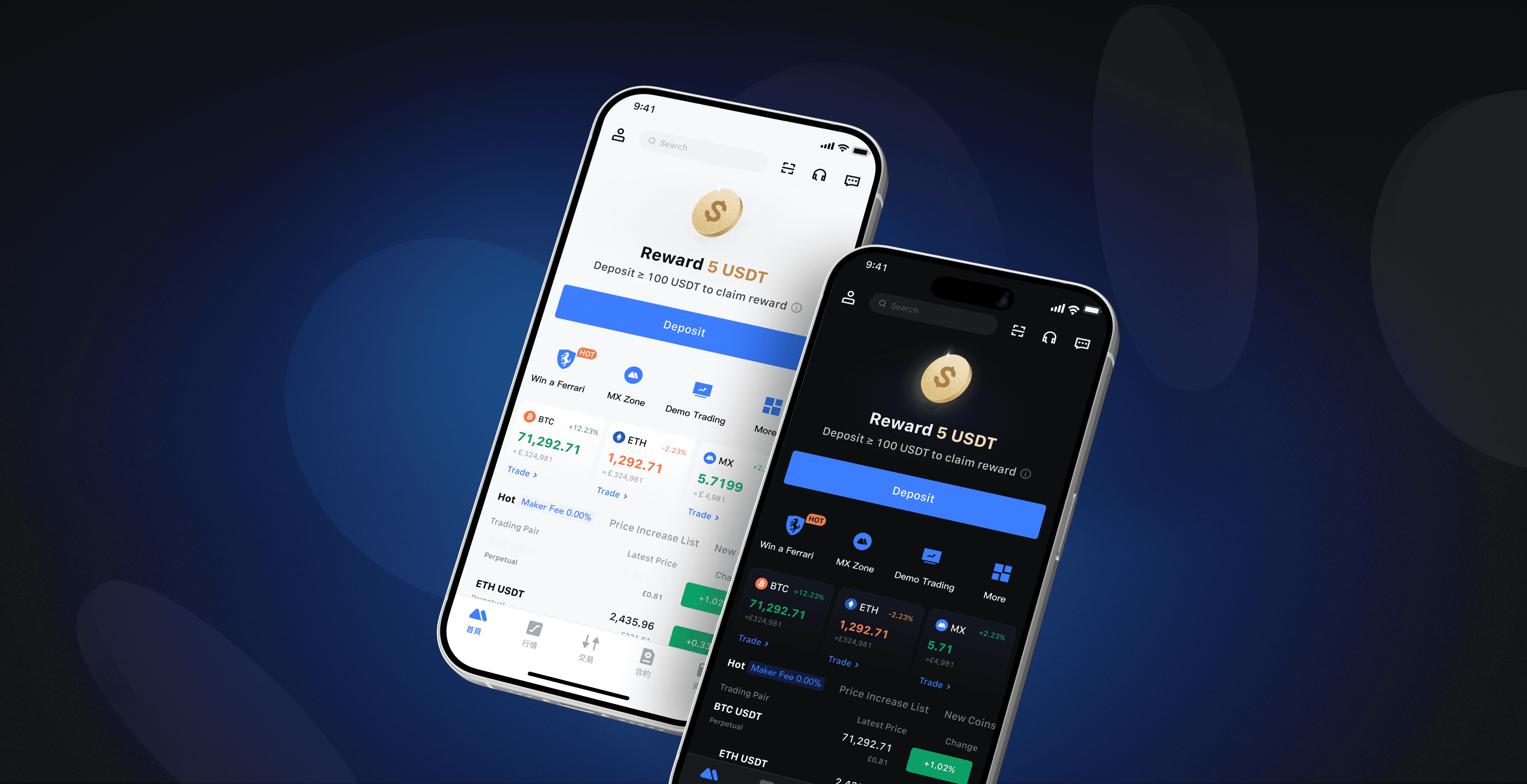
Framed the first deposit as a guided step, not a financial commitment
Broke the flow into small, understandable actions instead of a single decision point
Surfaced contextual reassurance (amount, timing, reversibility) at the moment users needed it
Key Insights
1
For new users, deposit is a motivation issue, not a usability issue
Most newly registered users did not hesitate because they couldn’t deposit, but because they were unsure:
whether depositing was “worth it”
what immediate value they would receive after depositing
When the value wasn’t clear, users often chose to wait rather than take action.
2
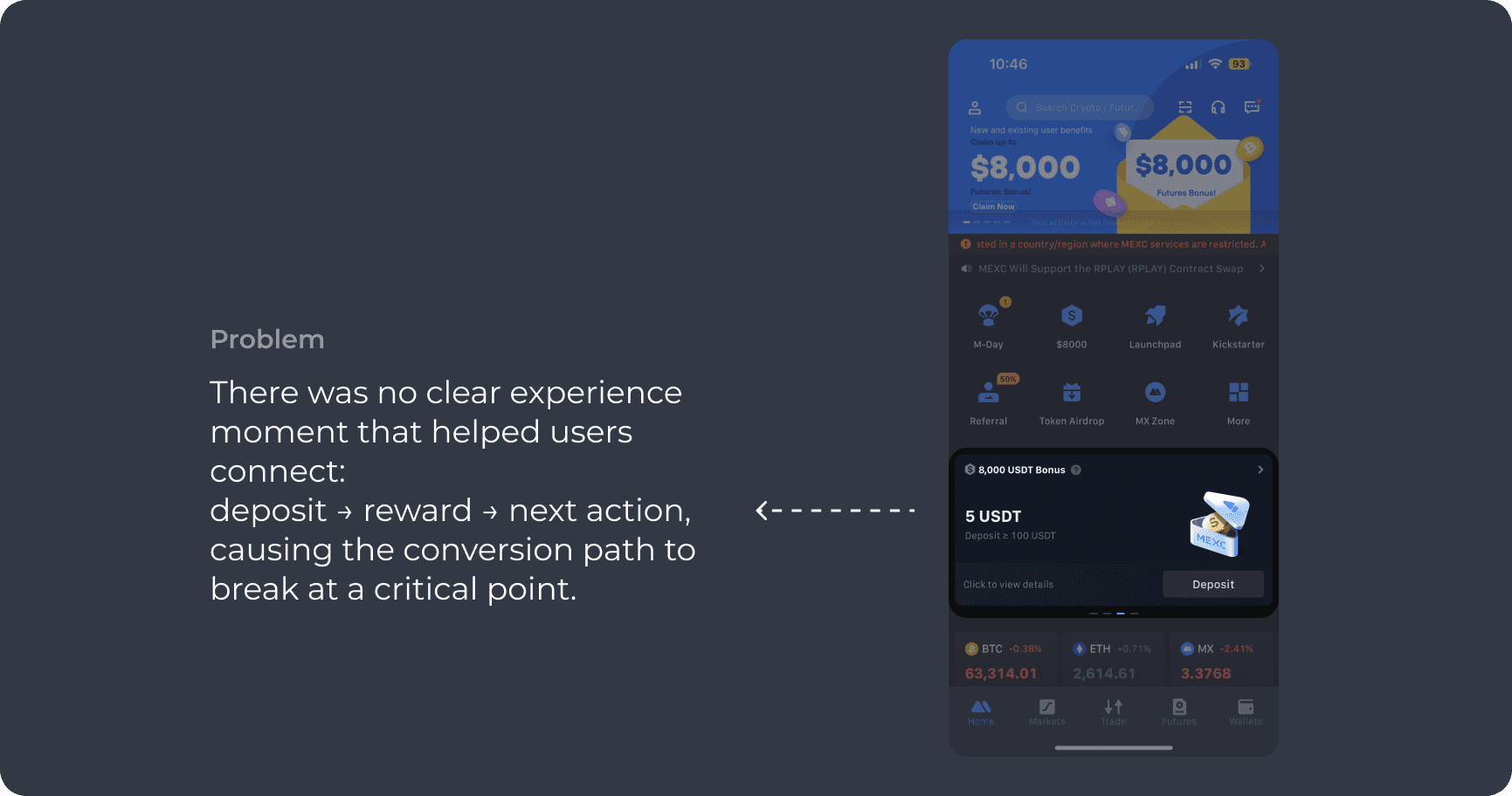
Without a clear action handoff, users tend to delay activation
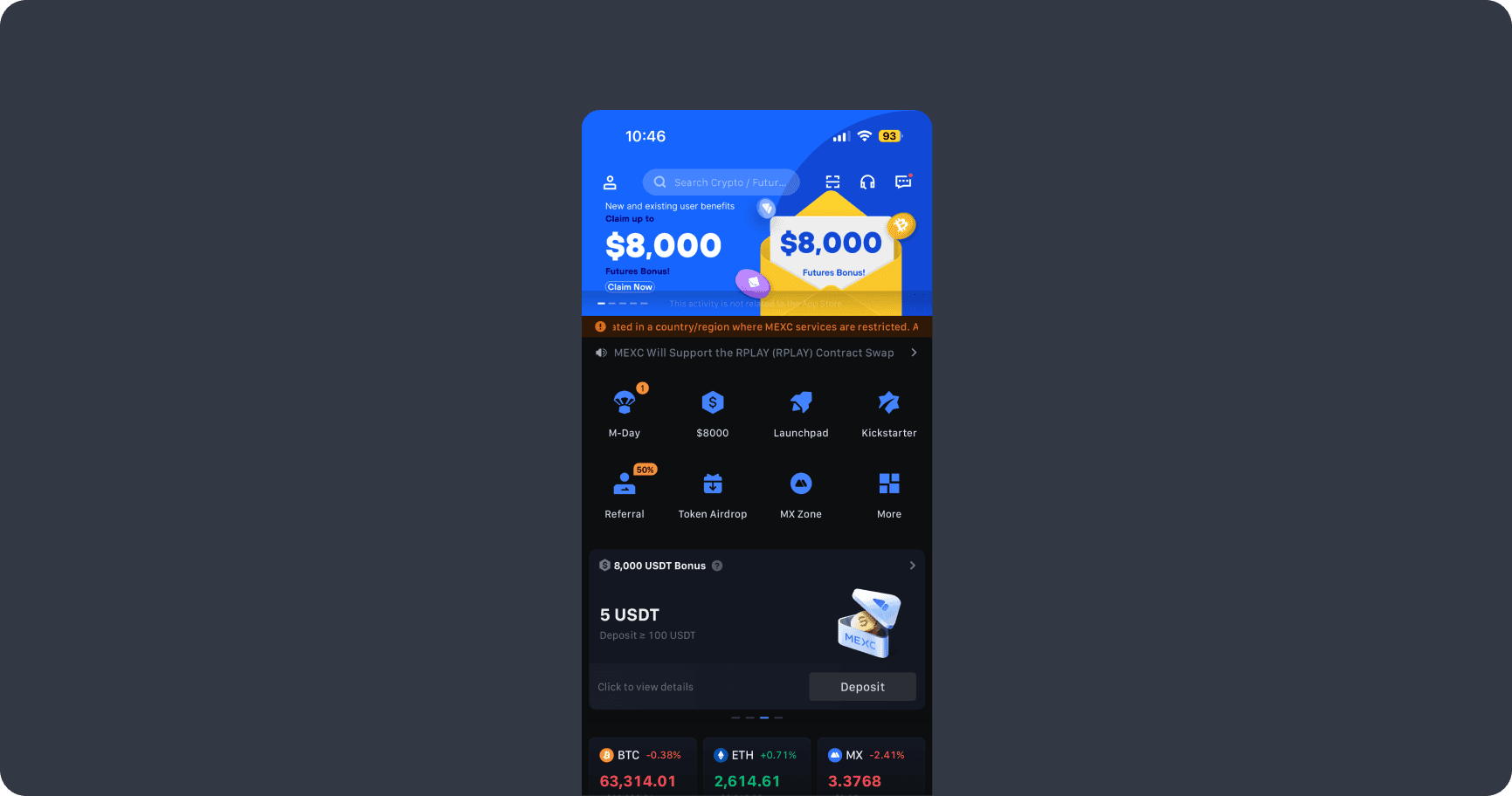
After registration, the experience quickly shifted back to a general product layout. New-user rewards were easy to miss, and tasks and benefits were spread across different areas, making it unclear where users should start.
Design Solution
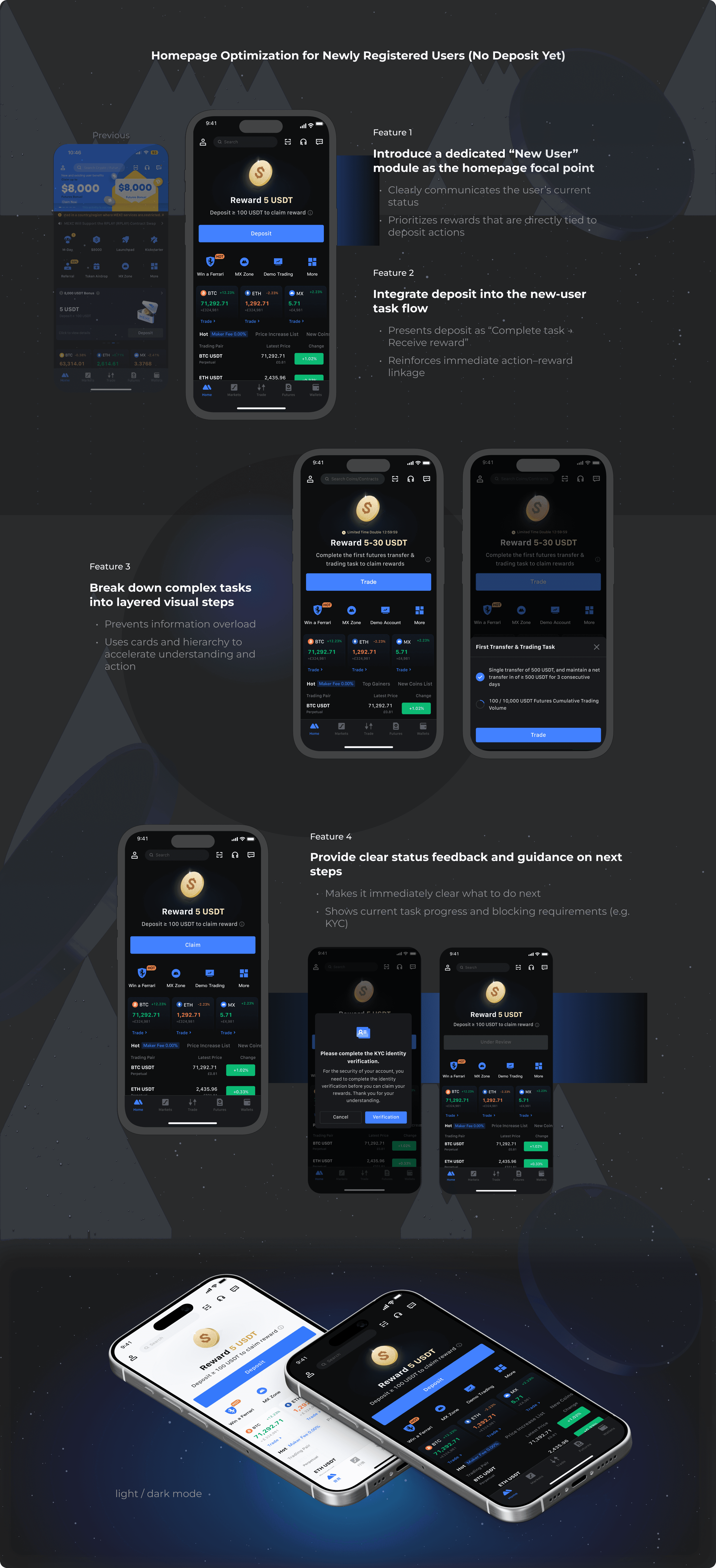
Design Solutions
Outcome
The revised flow helped users understand both the purpose and the safety of their first deposit.
By clarifying expectations and reducing hesitation, more users were able to complete their first deposit.
Design Impact
Deposit was reframed from a feature users had to discover into the most natural next step after registration.
By matching the experience to the user’s state, the design helped users move forward instead of leaving them to figure things out on their own.
Reflection
Effective onboarding is not about offering more options, but about guiding the right next action.
This project reinforced that effective activation is less about adding more prompts, and more about guiding the right next step at the right time.
Introduction
At a Glance
Problem
After signing up, many users paused before making their first deposit.
They were unsure about the right timing, the minimum amount, or whether the action was reversible.
As a result, many users dropped off at a critical moment in onboarding.
The Goal
Primary Goal
Guide newly registered users to complete their first deposit
Supporting Goal
Make the first deposit feel clear, reversible, and guided—rather than overwhelming or risky.
Key Design Decisions
Framed the first deposit as a guided step, not a financial commitment
Broke the flow into small, understandable actions instead of a single decision point
Surfaced contextual reassurance (amount, timing, reversibility) at the moment users needed it
Key Insights
1
For new users, deposit is a motivation issue, not a usability issue
Most newly registered users did not hesitate because they couldn’t deposit, but because they were unsure:
whether depositing was “worth it”
what immediate value they would receive after depositing
When the value wasn’t clear, users often chose to wait rather than take action.
2
Without a clear action handoff, users tend to delay activation
After registration, the experience quickly shifted back to a general product layout. New-user rewards were easy to miss, and tasks and benefits were spread across different areas, making it unclear where users should start.
Design Solution
Design Solutions
Outcome
The revised flow helped users understand both the purpose and the safety of their first deposit.
By clarifying expectations and reducing hesitation, more users were able to complete their first deposit.
Design Impact
Deposit was reframed from a feature users had to discover into the most natural next step after registration.
By matching the experience to the user’s state, the design helped users move forward instead of leaving them to figure things out on their own.
Reflection
Effective onboarding is not about offering more options, but about guiding the right next action.
This project reinforced that effective activation is less about adding more prompts, and more about guiding the right next step at the right time.